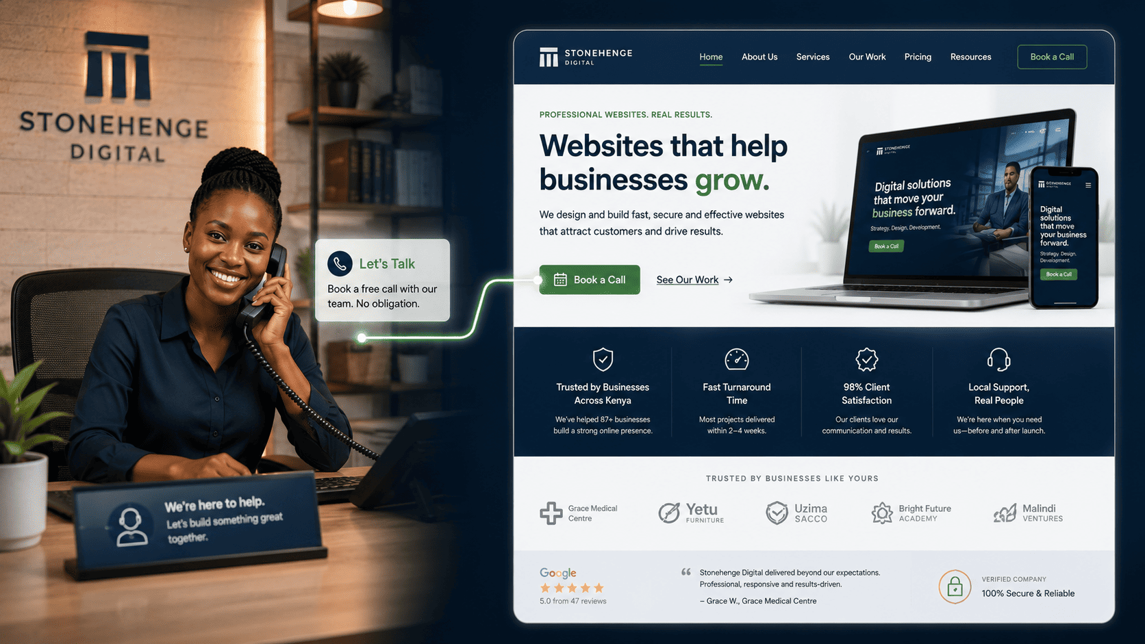
Imagine a Receptionist Who Does These 5 Things
When a visitor walks into your office, a good receptionist greets them warmly, asks how they can help, guides them to the right person, reassures them if they have concerns, and makes sure they leave with a next step.
Your website homepage should do exactly the same, digitally. Most Kenyan SME homepages fail at this. They are cluttered, confusing or self-absorbed.
A receptionist who ignores you
- Headline says only the company name
- Twelve menu items with no order
- No trust signals above the fold
- No single obvious next action
- Visitor wanders, then leaves
A receptionist who guides you
- Headline states who you help and what changes
- Five or six clear navigation paths
- Trust badges and proof visible immediately
- One prominent primary action
- Visitor leaves with a next step
The five jobs of a receptionist homepage
A clear headline that says what you do, for them
Within 2 seconds, a visitor should know if they are in the right place. Your headline should state who you help and what outcome you deliver. The company name is not a promise. It is just a name.
Say this, not that "We help Nairobi SMEs get KRA-compliant and loan-ready." Not "Welcome to ABC Consultants."Simple navigation that points to their problem
Do not overwhelm with 12 menu items. Use a simple navigation with 5 or 6 items, and consider a self-selecting dropdown that sends each visitor straight to relevant content.
Try an "I am a..." dropdown "I am a Procurement Officer / I am a Business Owner / I am an Individual." This guides them to relevant content immediately.Trust badges and social proof without scrolling
Your KRA PIN, a Registered Business badge, a client logo or a short testimonial should be visible in the hero section or just below it. This is the receptionist saying, do not worry, we are legitimate.
Placement matters If proof requires a scroll, most visitors never see it. Put at least one trust signal in the first screen.One primary, obvious call to action
There should be one primary action: Book a Free Call, WhatsApp Us Now or Request a Quote. This button should be the most visually prominent element on the page.
The receptionist test A receptionist would not let a visitor wander the corridors. Neither should your homepage. One clear direction beats five competing ones.A clear path for visitors who are not ready
For visitors who are not ready to contact you, provide a clear next step that keeps them moving toward conversion instead of bouncing.
Offer one useful exit "View Our Case Studies," "Read Our Services," or "Download Our Capability Statement."Where each job sits on the page
Order matters as much as content. A visitor scans top to bottom, so the five jobs should appear in the order a real conversation would happen.
The first screen, in sequence
Everything below sits above or just at the fold, so none of it requires a scroll to be discovered.- Greeting Headline stating who you help and the outcome you deliver, in plain language.
- Guidance Five or six navigation items, plus a self-selecting dropdown for different visitor types.
- Reassurance KRA PIN, registration badge, client logo or a one-line testimonial visible immediately.
- Primary action One visually dominant button: Book a Free Call, WhatsApp Us Now or Request a Quote.
- Secondary next step A quieter path for browsers: case studies, services, or a capability statement download.
Read it back as a sentence: who you help, how to find the right page, proof you are real, what to do now, and where to go if not yet. If any of those five is missing, the receptionist has left the desk.
The difference it makes
A homepage that performs these five jobs becomes an efficient, 24 hour receptionist. It qualifies leads, builds trust and guides visitors to action. It reduces the burden on your human team and converts cold traffic into warm prospects.
Greet, guide, reassure, offer help and show the next step. That is the whole job of a homepage, and it is the same job a good receptionist does every day.
Does your homepage pass the receptionist test? If not, it is time for a redesign.
Ready for a homepage that works the desk?
Stonehenge Digital builds organisational websites with clear headlines, guided navigation, visible trust signals and a single obvious call to action, so every visitor is greeted properly.
Design My Homepage Like a Receptionist →Interested in Portfolio & Organisational Website?
Let's build this for your business
A professional, mobile-first website that makes your business look credible and gets found on Google.